23 Conversion Rate Tests Every Shopify Merchant Must Try
A few weeks ago, I wrote about what a conversion rate is and how to calculate it. Now I want to talk about how to improve the conversion rate tests you have.
First things first, the only good way to optimize your conversion rate is through A/B testing (also known as split testing). A/B testing is a method used to test (typically small) changes on a page, email, or product by splitting the traffic equally to the two different versions.
For example, an A/B test of an email subject line would mean that you send 50% of your audience one version of the subject line and 50% receive the other version. You can then compare the open rates of A and B to determine with subject line worked better. (Do note that it is key here to only change one thing. If you are testing subject lines, the body of the emails should both be the same. And the change typically should be small. You want to be able to pinpoint precisely what is making the difference, rather than testing two things that are different for multiple reasons.)
A/B testing can be achieved most easily through a software tool, like Optimizely, that allows you to run both tests simultaneously. However, if you don’t have the budget for that, you can run your tests the old-fashioned way. Set your page up for test A and leave that running until you’ve hit the amount of traffic you’ve determined to be a sample size of statistical significance. (Learn how to calculate that sample size here.) Report on the outcome and then set the page up for test B, rinse, repeat.
You’ll need to identify things across your site (often on your product pages) that you think may be affecting your conversion rates and set to A/B testing them. While there will be plenty of tests you can run that are totally unique to your store, there are a number of tests that all eCommerce store owners should run. And since tests need to be run on very discreet, small aspects of your store, I’m going to break these tests out into categories, rather than just listing all of them in a row.
Get MESA free for 7-days and enjoy support from automation experts!
Topics:
Free shipping thresholds
The positive effects of free shipping on eCommerce businesses are well documented at this point. If you don’t have a free shipping threshold yet, your very first conversion rate test should be to get one. (Learn how to calculate a good threshold for ROI here.) Once you have a free shipping threshold, there are a number of different aspects you’ll want to A/B test.
- Threshold value. While you should know the lowest you can go and still make a profit, testing out different thresholds is always a good idea. You want to look for that sweet spot where the threshold is high enough that you’re making a profit after shipping, but low enough that it’s still compelling to customers. (Ideally, the sweet spot doesn’t just increase your conversion rate – it raises your average order value, too.)
- Your display method for the threshold. Does a footer banner work better than a header banner? Maybe a pop-up box works the best?
- The design of the display method. What colors work best? How big? How long should it take to appear (if any time at all)?
- Geotarget the shipping messaging. Jon Corwin, Director of Growth Marketing at Sunglass Warehouse, found that by geotargeting Canadian traffic with their specific Canadian shipping rates increased a 28.4% lift in conversion rates!
Coupon codes
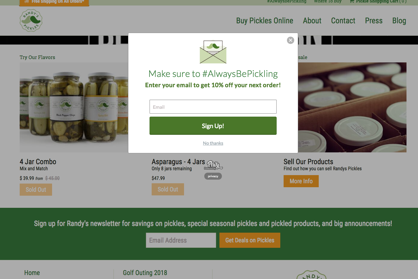
Coupon codes can be a fabulous way to increase conversions – particularly of new visitors. The classic method you’ve likely seen is offering a new customer 10-20% off their first order in exchange for their email address.

Ultimately, there really are a myriad of ways you can test out coupon codes to learn how they affect your conversion rates (and average order totals) but here are some examples to get you started:
- Coupon amount. You should test out both percentages and fixed prices (20% off vs $20, for instance) to learn exactly what your optimal number is for driving conversions. Alex Membrillo, CEO of Cardinal Digital Marketing, for instance, mentioned that he has found using a 10% off coupon has averaged a 30% lift over no coupon.
- Coupon delivery method. Is it more effective to display the coupon code on your site, add it automatically to their cart, or just send it to their email?
- Create a sense of urgency by testing out giving a time limit to the coupon. A sense of urgency may or may not impact your conversion rate, but you won’t know until you try.
- Call-to-action (CTA) display. Similar to the free shipping method, what works better: banner, pop-up, sidebar, etc.?
- CTA display design. Again, colors, size, timing, etc. These seemingly small changes can lead to big changes. For instance, Matthew Jones of Circulate Digital found that changing the color of a CTA button for one of his clients led to a 32% increase in conversion rate.
Product prices
Product prices can have a massive impact on your conversion rates – and not just by being lowered. The human brain reacts to prices in some very interesting ways. For instance, sometimes raising pricing can result in an increase in conversions, or a product can perform better when the price is raised a few dollars to end in a “9.99.” That said, here are some testing ideas for you:
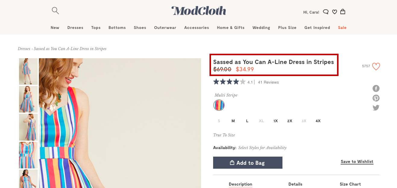
- When you put an item on sale, test displaying the original price with a slash through it next to the new price.

- A/B test changing your prices to end in a “9.99.” Numbers ending in 9 are most compelling to people. They also have the added bonus of allowing you to essentially add $10 to a product, but “trick” people into thinking they’re purchasing it at the lower 10s spot. (For instance, $39.99=$30 to the brain for some reason, despite actually being far, far closer to $40.)
- Offer multiple pricing tiers to capture multiple price markets. This is obviously not an option for all stores, as not all products lend themselves to pricing tiers. However, more products than you might imagine can be tiered. A good example of this is how Sephora often offers travel or mini sizes of products for lower prices. These travel sizes are an easy way for people who don’t want to spend full price to still purchase the product.
- Test creating a sense of urgency by putting a time limit on a price (typically done in conjunction with a promotion rather than just with the standard pricing). You can test out different methods for creating the sense of urgency as well. Is it more effective to simply tell the customer how long they have or does a countdown clock work best?
Cart abandonment
Abandoned carts are perhaps the biggest problem online retailers face today. Around 75% of carts are abandoned. The good news is, there are plenty of tests you can run to help decrease your abandoned carts!
- Test abandoned cart follow-up emails. These emails can often be triggered within your existing email marketing software, but if they can’t (or you don’t have email marketing software yet), there are a number of solutions available to send these abandoned cart emails. For instance, Shopify users can download our app, Kit Karts, to trigger them!
- Test out sending coupon codes in your abandoned cart emails to incentivize customers to come back and finish the purchase.
- Test a single page checkout vs a multi-page. It used to be canon that the single page checkout experience was better, but that’s since been disproven. Customers do want an easy checkout, but that can be delivered in a number of ways. See what works best for you. Jason Scott, a Digital Marketing Specialist for SessionCam, mentions that even reducing the height of your form fields or the space between fields can help make a form look shorter and simpler without reducing the actual amount of information you take.
Product page changes
Product pages are a key part of a customer’s journey to the ultimate conversion of making a purchase. They also offer plenty of opportunities to A/B test.
- Test your add-to-cart button in every conceivable manner. Design, wording, location. If you can think of it, A/B test it.
- Test product recommendations. Many sites now serve product recommendations on product pages in an effort to boost order value. This method works very well for some businesses, but does it work well for yours? A/B test product recommendations on your site to learn if they work as intended or if they’re just distracting from conversions.
- Test out different product images. Are your products more appealing with or without a human in the shot? As just a product floating in space or with a background? Is there a certain number of photos that seems to be the sweet spot? What about product videos? Mark Aselstine, founder of Uncorked Ventures, found that a product video nearly tripled the conversion rate on one of his wine club landing pages!
- Test out reviews. It’s pretty well-documented that product reviews are good for conversion rates (even the bad ones), if only because they act as a social proof. But you should still test stuff like location on the page, design, etc. You should also consider working with non-traditional reviewing apps to get the same concept of social proof. We have an app for Shopify users called Smile that allows customers to leave an emoji reaction on products. It’s a low barrier to entry for busy customers who may not want to leave a paragraph of text, but it still allows them to show other customers that people are buying your products.
- Product descriptions. Again, test design and page location. But you can also test out different wording. Does a short description do better than a long description? Does a storytelling description do better than a practical description? Do one or two words make a big difference?
- Load speed. The amount of time it takes your page to load can make a huge difference in your conversion rate. Even a second can make a big difference believe it or not. Elizabeth Bradshaw, owner of Canvas Art Boutique has run multiple tests to reduce load time that ultimately took her load time from 7 to 4 seconds, and increased her conversion rate from 1.1% to 2.6%! (She recommends compressing your images, minifying CSS, and eliminating render blocking Javascripts to achieve the same results.
- Simplify your page. At the end of the day, having more things – even graphics – on your pages is not always a good idea. Graphics, words, and menus can distract customers from completing the conversion, rather than encouraging them. Chris Bilko at Toffee Copy mentioned that he once ran an A/B test where he removed a single banner promoting a different sale from a client’s landing page and increased conversions by a whopping 83%!
Test to infinity and beyond
These 23 tests are just to get you started. A/B testing should be more or less a never-ending process for store owner, because you can always make things better for your marketing workflows. Once you’ve exhausted the ideas here, you should be on your testing feet and coming up with fantastic ones of your own.


